
Link: https://www.gamemaps.com/details/16692
https://steamcommunity.com/sharedfiles/filedetails/?id=672231603
Author: Soup Toaster
Survivors: L4D2
Notes: The campaign chooses randomly between two possible maps for both the second and third chapter of the campaign.


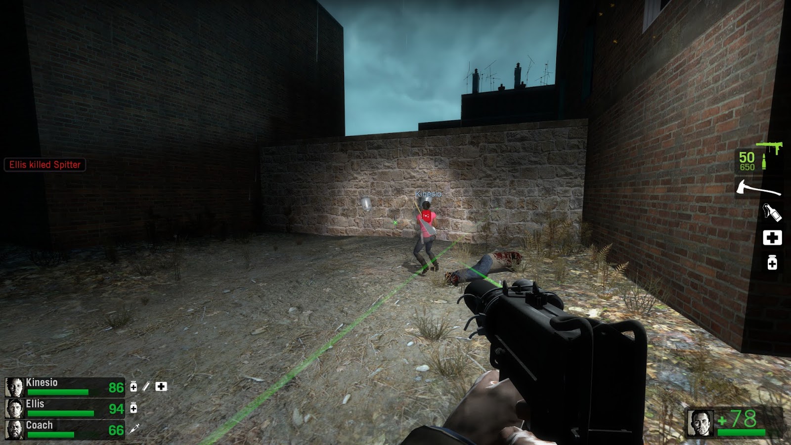
This campaign was designed by the same person who had previously created Die Screaming and, later on, Deadworld (an even more ambitious project that has since appeared to be abandoned). Deadenator has an awkward story in its description about a cult using a radio tower to send out messages to lure unsuspecting people to kill them or something, and the survivors have to take out the radio tower to stop the transmissions. It's one facet of a larger picture where semblances of ambitious ideas are in place but aren't developed well. The campaign starts off in a back of a plane, after which the survivors grab health kits and primary weapons before falling out. The part immediately following this sequence is the introductory gameplay section that's, to my knowledge, completely unique to only this campaign, in which the survivors all start out in separate sections and have to find each other. It's an interesting idea and works to varied degrees. I've seen cases where everybody finds each other without problems and other cases where someone gets pinned and dies, so it's of course a mixed bag. It would've been ideal if only boomers and spitters could spawn in the beginning, preventing the possibility of a survivor getting pinned by a special infected that he couldn't see or block in time.


That's why the second map really falls victim of a really shitty attempt to circumvent this design flaw, which is to put orange arrows everywhere. The map is fairly big and surprisingly well-optimized, true, but even well-optimized maps become slogs when you're going through nondescript, pitch black buildings where all you're doing is following arrows on a wall. I'm not exaggerating when I say that there must be at least a couple dozen of those arrows in this map alone. I get that the arrows are probably reversed when going through the opposite direction, but it's simply not fun to follow arrows on a wall that just point in arbitrary directions. A good campaign shouldn't need arrows to direct the player where to go, because good campaigns will lead the player by things natural to the level: architecture, lighting, vehicles, items, and events. I'm harping on this point a lot because there's zero point in making your map possible to be played backwards and forwards if the map itself isn't fun to play. Any map can be adapted to being played forwards or backwards, it doesn't mean they all should. That effort really should have been directed towards making one map that was solid, logical, and fun in a single direction, not expanded into a randomized two-version gimmick where neither version holds up. And while we're on the topic, can someone explain to me just what the building is that you're going through? Is it a hospital? School? Office? Retirement home? Just what kind of huge building is that barren and devoid of indication of what it is?


I thought the car lot in particular looked very nicely developed. Unfortunately that area isn't nearly long enough, or perhaps the rest of the map feels much less developed by comparison. Upon going through some more random buildings, you'll receive a message stating that you need to find a key to open a door to proceed. It's pretty obvious where to start looking for this key, but you'll soon come upon a rather annoying challenge, where a tank punts a number of cars from across the map at you and the other survivors. It's at this point where it's 50/50 as to whether any of the bots will make it, which are terrible odds. I understand that some campaigns may be designed with four human players in mind, but a campaign of this type, where so far the only challenge has been infected, should really only be challenging based on the merits of the Director's spawns and the level geometry itself. This clearly hasn't tried to be some sort of environmental challenge map like the hehe series or Grey Box. So I really don't think it should start to leave the fates of bots in the hands of RNG, especially when bots can be crucial to people who only have the option of soloing campaigns of this length.


Anyway, after suicide jumping out of that useless building, there's a large and equally useless courtyard that had a witch guarding the way forward for some reason. After that there's a gauntlet through a building and it seems like it's going to be the finale, but it's really just a gauntlet to an elevator. Again, it would be nice if this were made more clear, but I guess clarity isn't really this campaign designer's strong suit. The gauntlet is surprisingly okay, and if it had been extended to be the real finale, it might have made for a fairly strong ending to the campaign, but alas, the campaign continued on from there.


Difficulty: The difficulty in this campaign comes more so by its sheer length and by a couple of gimmicks, most notably in the beginning when the survivors are all separated and also where flying cars can instantly incapacitate players who fail to dodge or notice them. Supplies are in fair numbers, but the maps may drag on to the point where it feels like special infected attack relentlessly. It's still fair but a couple of more additional ammo piles wouldn't have been too much to ask for. This is at an overall average difficulty.

Final Verdict: Deadenator is a campaign that needed to have its ideas reined in and its gimmicks either worked out better or removed. As it stands, it is overly ambitious and works most successfully when it's at the most typical, formulaic Left 4 Dead. That's not an insult to other campaigns; the first campaign I can think of that does the Left 4 Dead formula well is Detour Ahead, and that campaign is great. Deadenator, however, tries to be original in ways that simply make me wonder why that effort wasn't put into making the maps flow better. The first map is clearly the best and the second map is clearly the worst, while the third and fourth have equal parts good and bad. The environments are sufficiently detailed but ultimately my singlemost criticism of the campaign is that it feels too nondescript. And in terms of the logic of the design layout, aside from the first map it can be either confusing or too random. The holdout area for the finale is also very forgettable. I do feel that with strong revisions this could still be something noteworthy, but as of right now the only thing of particular note is its length, with the fact that it can go on for an hour or more for only four maps. It's hard to know whether or not to recommend this one; if you enjoy city maps at night, even if they're fairly nondescript that don't really have much of an identity of their own, you could do a lot worse than this one. However, this really misses the mark of greatness because it doesn't strike out on its own original path enough and doesn't develop its ideas sufficiently through the environment enough. It's still above average since it's clearly got some nice polish, but I didn't come away feeling that I played something particularly memorable.
Rating: 3.85/5.
No comments:
Post a Comment